Team projects at Exove: Taakka, the team daily tool
Besides client work, teams at Exove get to work on team projects. Our team decided to tackle a long-standing pet peeve in company communication: getting information on everyone’s workload without having to ask, well, everyone.
Let’s start off with a bit of background on the situation and our project’s raison d’être. I live in Oulu in the north of Finland, where I’ve been the team lead at our local Exove office since early 2016. Oulu, our team’s home away from HQ, sits some 400 kilometers – as the bird flies – north of our next-northernmost office in Tampere, and that bird flies another 150 km from there to our Helsinki HQ. Having multiple offices around Finland can occasionally cause communication challenges, let alone when there are offices in several countries. This is especially true for team leads and other roles responsible for resourcing people into projects, as they need to know who is available for a given task at a given time, preferably without having to ask around too much. This problem is commonly solved by daily standups, which provide this information to team leads, who in turn can inform the other parties when needed. It still involves asking around, however. What if daily standups were company-wide, with the information available to all at a glance?
Back in June 2017, folks at Fraktio introduced TeamDaily (blog post in Finnish in their blog), their open source team status tool. Considering how they seem to actually deal with weekly workload, I’m a bit confused about the tool’s name – but I digress. It looked like a genuinely interesting piece of software, and our team of team leads briefly discussed and tested it. Our company is somewhat different from theirs, however, so it wasn’t a very good fit – for example, we measure daily workload and have a team-based structure, while they apparently don’t.
Another unique thing Exove has is Exove Labs. It’s a concept for experimenting with new technology; from a developer’s perspective, that usually means you get to work with things you’ve never worked with before, or improve your knowledge of a tool you rarely get to use. You might even get to create a pun-telling teddy bear. Luckily, what we had in mind was perfectly suited for Labs, as long as we could live with having to work in less familiar roles in the project in order to promote learning.
After the summer holidays last year, our team decided it was time to make the project we’d been planning for ages a reality. To spice things up enough to make it suitable for Labs and seem less like daily work, we reversed our normal developer roles. People who normally do mostly back-end work would advise the people who mostly do front-end work on how to build the back-end, and vice versa. That meant a trip to the front-end side of things for me, in addition to wearing the hats of technical lead, UX designer and project manager for the project. I seem to have a lot of hats.
Our role reversal also meant that, in order to stay effective, we couldn’t pick technologies completely at random, as someone still needed to have enough knowledge of the chosen tool to be able to advise others. After a brief debate on the benefits of Vue – which none of us had used – and React – which several had – we settled on the latter for the front-end. This ensured our tool would feel snappy and responsive and gave me a welcome opportunity to work with a React and Redux combo, so what’s not to like! We also decided to use Material UI; other internal tools, like our excellent Inside hour reporting tool, already used it, so we figured it’d make people feel right at home.
The choice of back-end technology was a bit trickier: most back-ends for tools like the one we were planning are built on Node.js, but since ours was going to be quite simple, there was an opportunity for a more exotic choice here. Many of us had extensive experience in Drupal development, giving us at least a rudimentary understanding of how PHP’s Symfony framework does things. With that in mind, we decided to go with Laravel, just to see what it does differently, and because picking Node.js would’ve been expected. Variety is the spice of life. We did decide to stick to a MySQL database, though; that decision, at least, could never backfire. Ever. Not in a million years. Cough.

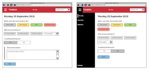
With the technologies settled, it was time to start the basework, create some quick UI sketches, decide what information our tool would collect and – the most difficult task of all – decide on a name. Oh man, naming things is hard! Picking the name was probably the single most time-consuming part of the project. After a lot of silly jokes around micromanager 3000 and the business of measuring busyness – and a brief foray into the realm of very odd-looking words from the Oulu dialect, like Ölövi – we finally settled on Taakka. For the linguistically challenged, that’s Finnish for ‘burden’. It was perfect, because in the end, that’s really what we’re measuring: how much your workload is burdening you. Inspired by our collective genius (ahem), I even sketched a fitting logo for our tool as a surprise side project. It’s a wheelbarrow full of bricks – what’d you expect?

Deciding the information to be collected was fairly easy. We had a nice screenshot of Fraktio’s questions to go on (thanks guys!), as well as our own existing team dailies. Those had a pattern more or less like the following, with slight variations from team to team:
-
1
What have you achieved since the previous check?
-
2
What will you achieve today?
-
3
Are there any blockers?
-
4
Does it look like the estimate for your task will hold?
-
5
Has the client asked for extra work?
-
6
Do you have enough work for the next 4 days?
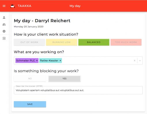
That pattern was a good guideline for the information we needed to collect. We mostly liked the questions in TeamDaily – what you’re doing, how you’re feeling and what projects you’re needed for. At the same time, we wanted to minimize the number of clicks and typing needed to create an entry on a normal day. We also decided not to include any personal questions before we had time to implement user roles and proper authentication, so that we could make the answers to such questions private if need be. You know the trope – it’s on a need-to-know basis and pretty often, you just don’t need to know. After a lot of discussion, what we ended up asking in our Minimum Viable Product were these three questions:

-
1
How is your client work situation? (out of work, running low, balanced, or too much work)
-
2
What are you working on? (pick projects from a list)
-
3
Is something blocking your work? (yes or no; if yes, write down what)
In short, we picked the questions from our previous dailies that dealt with the present. The past anyone could see by looking at the overview page, and the future – workload for the coming days and clients asking for extra work (i.e. future resourcing) – is dealt with in an entirely different tool, anyway. This meant that, in an optimal case, it could take you as few as five clicks to be done with the daily: pick your work situation, open the projects dropdown, pick a project, pick no blockers, click save. However, some people have felt that, besides reporting blockers, it’d be nice to be able to report problems and hiccups of a more generic nature, so the wording of the last question might yet change.
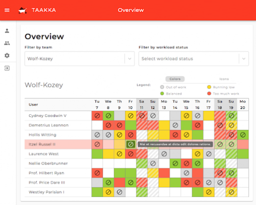
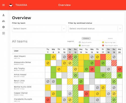
All the information we collect can be viewed on the Overview page, which currently allows filtering people by team and workload, with several more filters being planned. The overview gives team leads easy access to their team’s status and those people who need to get some work done a quick way to find people who are low on or out of work.

There’s still a lot of work to do – dozens of feature requests have been filed after all development teams were pressur… uhh, “politely asked”, to start using the new tool. These range from adding extra questions to creating a Taakka Slack bot. Taakka is obviously an engineering solution to a very human problem, so it’s not without its downsides: some people in our closely-knit teams feel this sleek new tool takes away from everyday human interaction, and that’s a valid point. They might yet get some of that interaction back in the form of weekly meetings, though, as some things are still best discussed face-to-face instead of screen-to-screen.
Looking back, the decisions we made in the beginning still seem sound: even as an MVP, the tool serves its purpose well. We no longer have to ask around for daily workload information, and the seemingly unholy combination of React and Laravel works beautifully. What’s more, our team learned a lot in the brief time we had to work on Taakka, and much of it was about things we wouldn’t necessarily work on in a normal client project.
Thoughts by


