Gradia
Fast & Furious – building the new web service for secondary education provider Gradia
Browsable. Attractive. Guiding. With these words we started building a web service for newly re-organized and branded Gradia, Jyväskylä Educational Consortium. In addition to organisational restructuring, legislation and funding reforms in vocational education and training over the past few years have also brought many changes for Gradia. As part of this renewal process their whole web presence was put under scrutiny and as a result our team was taken on to create a new site.
The key needs that the new site needed to meet were
-
1
How to familiarize yourself with the different education activities and trainings that Gradia offers?
-
2
How to ensure that different users find relevant information that is linked to their needs?
-
3
How to enhance the marketing and sales of education activities and trainings?
“We are building Gradia together with all our educational institutions.”
In the beginning we had brand guidelines, a requirement listing, a preliminary concept and an enthusiastic project team. In order to get to the bottom of things, our half of the team took a two-day trip to Jyväskylä to kick off the project and learn more about the needs of the organization. After two super full workshop days we had sorted out all of the preparation work Gradia had previously conducted and were ready to start building up. As the design team worked on a tangible prototype of the concept to be tested with the users, the tech team developed the base for the site with Drupal 8.
The first real test for the service concept came in the form of an intensive week, during which potential users of the service got to try out the prototype, give feedback and ideate further. And what we got were pure golden insights:
-
1
“I don’t have too much time to look for the trainings for the employees, it’s super important to find the correct class easily and have the contact informations at hand so that I can call at once.”
-
2
“When I was applying here, I was looking through the old site with my dad. Together we skimmed through the different possibilities. It would have been nice to see how the students feel of the studies as well
-
3
“Each of the high schools has their own thing. We’d love to save that and at the same time make it easier for those applying to really think through what they are looking for and based on that apply to the correct program.”
With these user insights and the client’s guidance the design team made the needed changes to the layouts and the developers moved on to do their magic.
“We picked the number one offer and got a number one site”

Close co-operation and active communication with the client via Slack kept development efficient – iteration needs were at a minimum and when changes were needed, decision making was fast and straightforward. The whole project team was committed to working with agile methods, which meant that the sprint meetings and backlog prioritisation were a crucial part of keeping the project on track and giving a view to the real time status of the project progress.
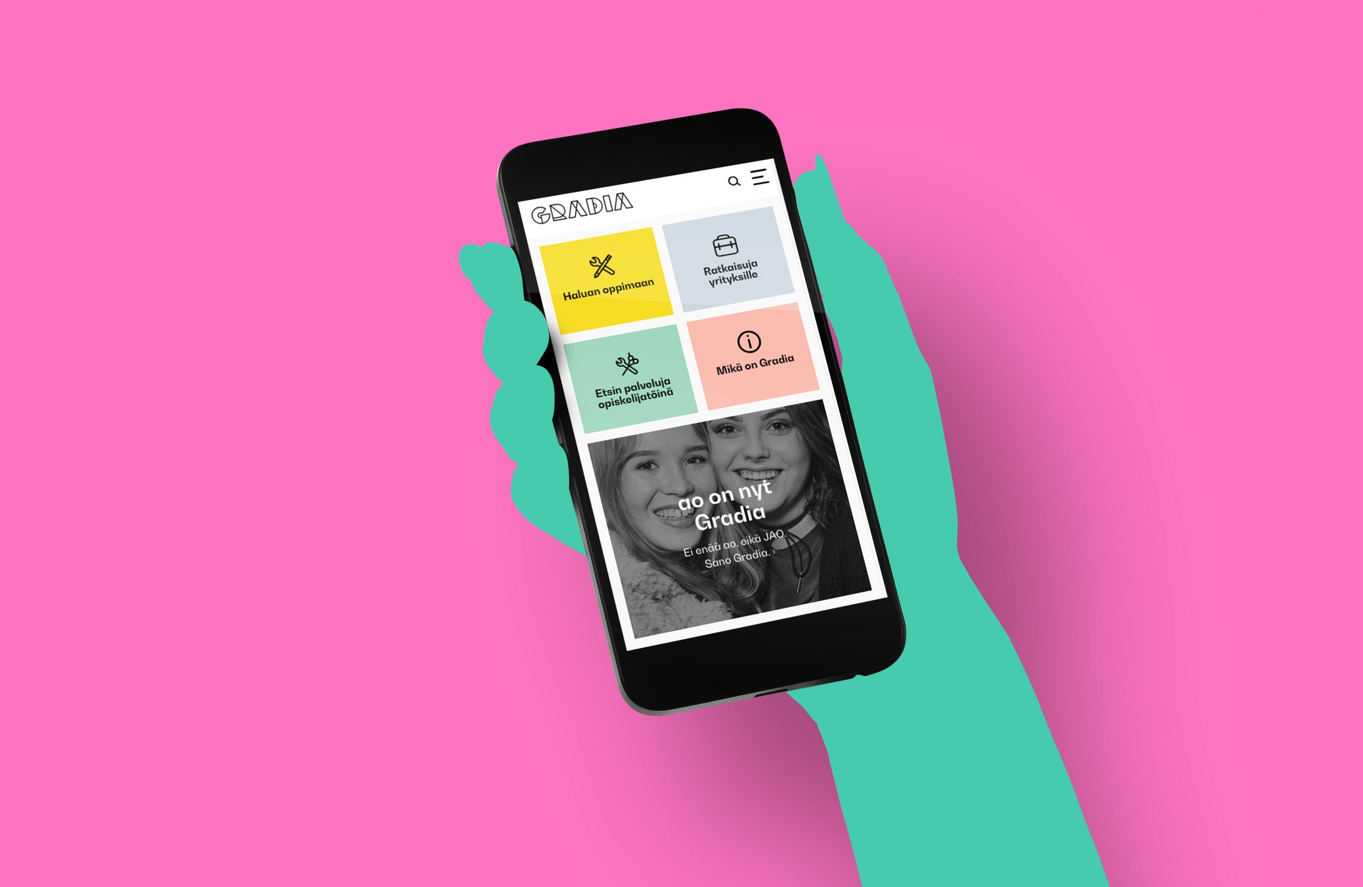
In the end, we had a truly mobile first site, which was developed together with the users and the client. The whole project team worked hard to meet the deadline and the site was launched just in time for Jyväskylä Educational Consortium to transform into Gradia.
Even with the site being live now the work continues – new content is created every day and some of the ideas that came up during the development work are now being evaluated for further development work. So far the ride has been a merry one and we cannot wait to see how the site starts to live on its own!
Project highlights
Co-creating and involving users.
To grow our understanding and empathy we worked across the user groups and took our prototypes to be tested with various user group representatives. The further development ideas we got were just amazing!
Working as a team!
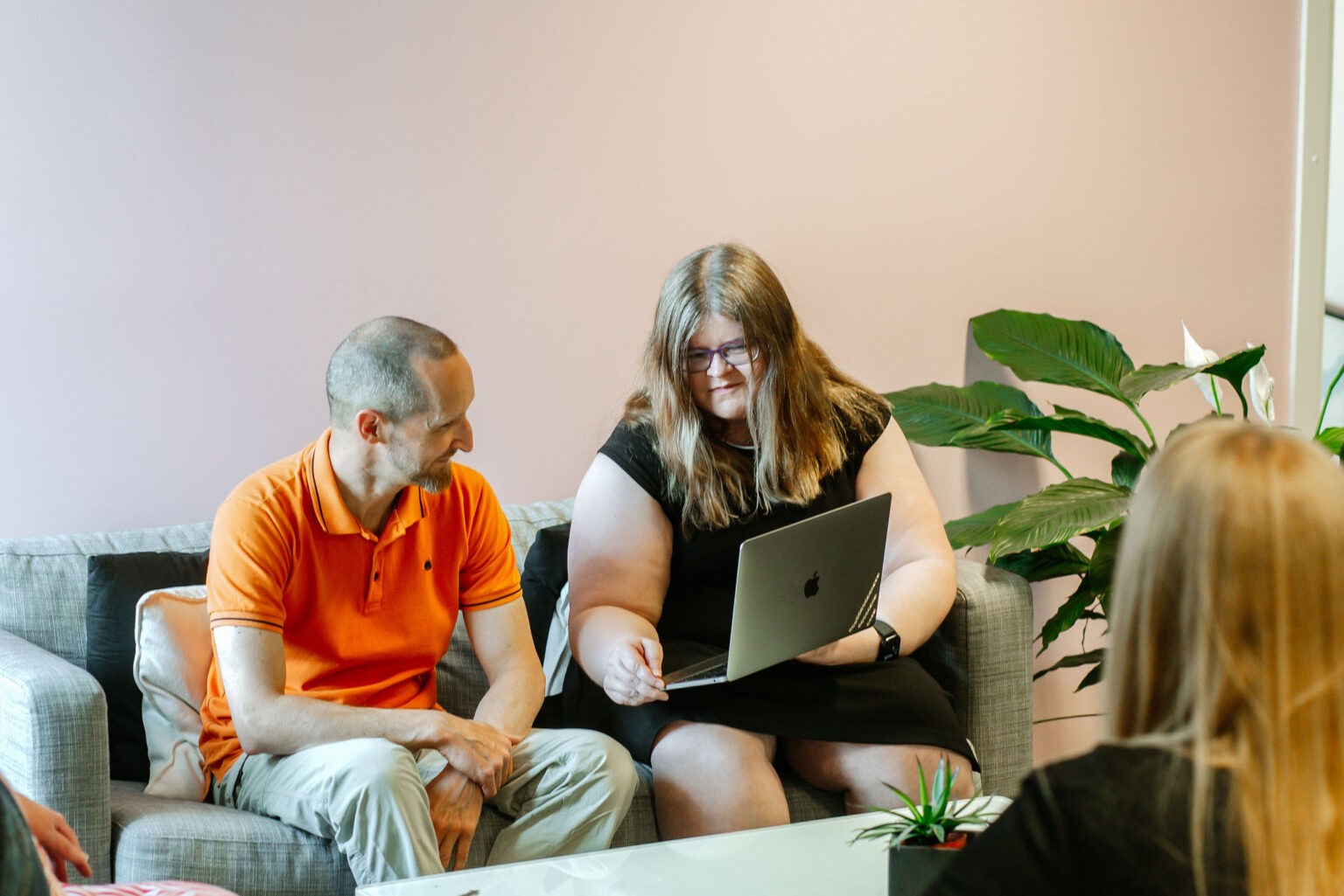
From the kick off to the launch we formed a team with the customer. All of us knew that it was going to be a tight project and working together continuously throughout the sprints and communicating daily via Slack proved to be invaluable. Communication was open and the working was fun.
A true mobile first approach.
The first prototype was designed for mobile and from there we took it back to the desktop. It was clear from the start that we are doing this for today’s users.


